


(Click To Enlarge For Best Quality)

Making a decision (Topic)
I have been on the Internet looking at different double spreads from existing magazines. I have analysed a few, giving me an idea of stereotypical layout, colours and so on.
I have been thinking of several different ideas that I think would create a good double spread. After going to the Brit Awards, I felt that an Award ceremony would be a good topic for my page especially because it can relate to my magazine. Whilst at the Brits I took several photos of different celebrities that were at a high enough quality to be used on a double spread. I then came to the conclusion that I am going to base it on the Brit Awards. However, I am not allowed to generally talk about the Brits, as this is not individual information. I have decided to stick with the idea of an Awards ceremony but with a different name whilst I re-create a logo, this is ideal as I can still use the raw photos I have already taken.
Font (Title)
I found looking at different fonts hard therefore I picked five main fonts and have analysed them, discussing both advantages and disadvantages. This should then help me come to the conclusion which font is the strongest and what will best suit my double spread.


After looking through several fonts I felt this one was appropriate. One of the advantages of this font is that it is similar to the ‘Brits Awards’ font. I want to re-create a similar style to the “Brits” font and this font seems appropriate. (Above)

This serif font has different connotations to the others. An advantage of this font it that it looks classic and elegant, however the genre of the awards I am trying to create is ‘Indie’ therefore I feel this isn’t suitable. (Above)
I felt an advantage of this font would be the effect it would have on an audience. However, a disadvantage would be the fact that this font would attract the wrong audience as I have aimed my product at a ‘Indie’ based audience. Immediately after looking at this font I thought that it was more likely to attract an audience who were interested in the genre of ‘RNB’. (Above)
Logo
I am going to design a logo for my double spread page. I am going to use the logo also on my front cover that my audience will see immediately. I am hoping this will attract and engage with the audience persuading them to read the inside of the magazine. I struggled to create logos as i found it challenging to create something from scratch. I created several logos in total and am going to analyse the best ones below which I hope will help me come to the conclusion of which will be my final logo.
The Making Of The Logo:

Original I looked for an image with a specific music note. Once I had found this image, I used the magic wand tool to select the music note I wanted and then copied to a new document. (Above)

Within the new document I duplicated the music note and rotated/flipped it thereby creating a ‘M’ shape in the middle, which stands for the word ‘Music’. I then used a different font for the other letters.
After creating the main part of the logo, I placed it on bright coloured background on the logo. I also then added a ‘sponsored by Visa’ as several of the existing logos have this, making my logo look more realistic. (Above)
![]()
When designing this logo I looked at existing logos that looked similar to the logo I have created. I like this logo as it is simple however I feel that it would attract the audience. I used different colours for the outlines of the letters creating an immediate effect. A disadvantage could be that it is simple however in this case I feel that it could also be perceived as a advantage. (Above)

When I was designing this logo I wanted it to look professional yet creative. I experimented with different fonts. To create the ‘M’ I used two music notes and emerged them together. I then used a font creating the effect of a paint look for the other letters. I looked at existing logos, which had block backgrounds behind. I felt this had both advantages and disadvantages. An advantage is that it stands out which would immediately attract the audience. (Above)
Colour Schemes
Earlier in my planning I have looked at several different colours and what they connote. When looking at different colours it is very important as I have to make sure that the colours I am going to use are suitable for the genre and type of magazine I am producing.
Black and red:
I have used these colours throughout my magazine. I feel that using similar colours continuously helps show continuity within the magazine. I have come to the conclusion that I am going to also use grey within my double spread. The reason for this choice is because I feel grey is quite a neutral colour attracting a wider/mass audience. Grey also works well with the vibrant colour red and black. I feel that a double spread may look to simple, using too colours therefore I have decided I am going to use grey for the background and then continue with the colours red and black.
Sketches
Below, I have drawn out some sketches that give me a guideline of how I can present my double spread. When making my final piece I am going to follow these, which should create a well-presented double spread. However, once on the computer it may look different and I may change my ideas.


Article
The EMA Awards 2010 held at Earls Court venue in west London last month has been voted the best music awards worldwide. Several celebrities performed outstanding performances; however someone the other hand weren’t so great. Jay-Z and Alicia blew the audience away with outstanding vocals. Robbie Williams as expected did not disappoint. Robbie Williams was honoured with the award for Outstanding Contribution to Music. He has won more EMA Awards than any other – 11 as a solo performer and four with his former band mates Take That. Cheryl Cole performed her single Fight For This Love who done incredibly well after the latest tabloid allegations about her husband, England and Chelsea footballer Ashley Cole. However this was not the case as people may have thought that it was a bad performance. Lady Gaga the eccentric performer, was the biggest winner at the EMA 2010 and took the award for most eye-catching outfit denying all claims of her gender.
Her performance was both emotional and memorable as she dedicated it to the wonderful designer Alexander McQueen; however was not what people expected to see. The younger people in the pit were not involved in Lady Gaga’s performance until she sang her latest hit ‘Telephone’. In the past 12 months she has enjoyed a rapid rise to fame, selling eight million albums and 35 million singles therefore when Peter Kay presented her with an award she gave a wonderful speech. As an audience member I was expecting more from Peter Kay because of his positive reputation as a comedian. However, it was said that he only said one quirky line throughout after the incident involving a member of Oasis. Liam Gallagher made a surprise appearance to collect the award, pointedly refusing to thank his estranged brother, Noel. He threw his award and his microphone into the audience, prompting host Peter Kay to say: "What a knob-head." I felt that the EMA Awards was
the best yet, this may have been due to it being the 30th anniversary of the EMA. Beat magazine exclusively went backstage allowing them to meet several of the acts including the fantastic performer Lily Allen (Visit page 20 for more information on her interview). She seemed pleased with her performance as she said “The audience were amazing, it was such a buzz. I would love to be back here next year”. The EMA Awards was such a great night. On behalf of all from BEAT magazine we would like to thank everyone involved in making the EMA Awards such an enjoyable experience. We also strongly agree with Lily Allen as we would like an invite for next year too. Yasmin Bogle BEAT Magazine Editor
Images
I have selected some of the pictures that I feel were the best quality. These photos were taken from an award ceremony that I had been to. I am going to use around five of the images making my double page seem realistic.Below, I have print screened the page to show some of the images I took. I am going to look at most of the images below, aiming to use around 5 for my double spread. I am going to edit each image, possibly making the image brighter which should make the images more professional.

I have selected some of the pictures that I feel were the best quality. These photos were taken from an award ceremony that I had been to. I am going to use around five of the images making my double page seem realistic.
Making the Final Piece
I made my double spread using Photoshop CS4. Below, I am going to show the stages explaining each one separately.


Within this section, I am going to show my planning which has been created in the process of completing the contents page. I have drawn out rough sketches showing my thought process and how I personally wanted my contents page to look; this was very beneficial as it helped me make decisions regarding layouts showing the images and information. I have continued to use the same colours used within the front cover (black and red) as I feel it shows professionalism to follow the same colour scheme throughout the magazine, this is known as continuity.
Fonts (Title)


Within the process of creating the font cover and contents page I have found that the black and red colour scheme is perfect for my magazine.
Black and red:
One of my ideas for my front cover was to use mostly the colours black and red adding some white. I feel that these are similar colours, which are regularly used on existing magazines. I like the idea of these colours as I think that it stands out towards the audience. I think that these colours reflect what is inside the magazine and is similar to a stereotypical music magazine front cover. When deciding the colours for my magazine I took the genre ‘Indie’ into consideration.
I have used these colours on my front cover and to follow continuity I have also used them for my contents page as well. I like the idea of three certain colours that keeps consistency throughout my magazine, hopefully making it look more professional.· Exclusive photo’s from the UK’s biggest music event which can only be the European Music Awards 2010
· Exclusive interview with American Band the Killers who have won four NME awards.
· Beat asked YOU who you thought the best band was in 2009 and who will take the spotlight in 2010.
· Beat will be given you a free guide to help you get the most out of this years V Festival. We are offering 3 tickets in this week’s competition.
· Florence And The Machine set for one-off UK gig - ticket details
· 2010 Line revealed
· Noel Gallagher Unearths Oasis Rarities at Solo Show
· The 100 Best Albums of the Decade


Mise-en-scene
This section of planning is where I am going to begin deciding the location of the images I am going to take, the costumes the models are going to be wearing and how they will be presented. I need to take into consideration the genre I am trying to create as all of these can make a huge impact on this.
I feel that the costume, hair and make up all play a huge part in the images as they can indicate a lot about a magazine. I have decided to keep the same look in each image because this is what is said to be the ‘Indie’ look. Although the make up, costumes and hair will stay the same, I have decided I am going to take pictures in several different positions in different positions which should all create different effects.
After the models were in costume I began to decide the location. I took pictures in several places and decided on the best three. For my first photo shoot I created a band using a guitar microphone and speakers; however I decided this was more suitable for the front cover.
I then took other images behind a collage of magazine with one of my characters in front using a guitar. I also then took a similar picture but in front of a brick wall creating a different effect, which I also liked.
After taking several images I decided to edit a few. I then came to the conclusion that it may be a good idea to use a number of the pictures on the contents page. I am going to edit ten photographs independently to create the desired look. I thought of an idea of how I could present them all of one page. I am going to create a Polaroid effect giving the pictures more creativity and eye catching for the audience.
Images
I have taken screen shots, showing some of the pictures of which I have taken. I have selected the images that I am going to use for my contents page, annotating them.


Although I felt that the above was a huge advantage, I also feel that there are more disadvantages with this contents page I have designed. It is said that pictures attract the audience, however I have not added any due to the lack of space left on the contents page.
Another disadvantage is the size of font. I have decided that it would be beneficial to decrease the size of the font allowing more stories to be seen.
I like the idea of this magazine, however I feel their needs to be improvements. After evaluating this I have decided to use this first drafts changing the disadvantages into advantages. (Above)

Ideas of the Magazine Title.
These are the ideas that I thought would be am ideal title for my magazine. When thinking about both advantages and disadvantages I feel that ‘Beat’ is most appropriate for my magazine as I feel this will attract the target audience I am aiming my magazine at.
The Beat
Volume Control
When I first started planning I thought this would be a good idea for the main title. However, after completing my research I felt that this would help later as a band name.
The Mix
Mega Mix
BEAT
I have chosen ‘BEAT’ because it is a one-syllable word, which will attract the audience. ‘BEAT’ is catchy and easy to remember, it also represents music, as it is part of music terminology that is relevant as it gives the audience a quick insight into the magazine.
The Hits
T
I used many different sources including the internet and existing magazines for inspiration when looking for different fonts. I was not sure what I wanted therefore this part of production was challenging. I looked at several fonts and narrowed them down to five. I analysed them and looked at both the advantages and disadvantages of the fonts which helped me make a difficult decision for the title of the magazine. When making my decision I took into consideration styles, textures and the overall feel of the font to see if it was suitable for a music magazine.

This font grabbed my attention immediately as it was perfect for what I wanted. In my opinion I believe that it has no disadvantages apart from colour which can only improve the font. Its main advantage is the fact it is stereotypical for a magazine font. I was also pleased with the look of my magazine front cover when this font was in use as it is similar to the style of the ‘NME’ font which can only be a good thing as ‘NME’ are highly successful within the creative media industries. (Above)
When I was picking my title, I thought this was a well-presented font. An advantage it has is the glow, to improve the glow I feel that colours could be experimented with to give a vibrant look, which would attract the audience’s eyes. A disadvantage is the style of the font; this font looks like it is more suited to be seen outside a theatre therefore not suitable for the genre of my magazine. (Above)

Ilike this font for my title; however I do not feel that it would suit the front cover of my magazine. Its advantages are the character spacing, as it looks distinctive and different to any other magazine. The main disadvantage is the fact that it is basic, this is shown with the lack off glows and drop shadows which are a fundamental part of the codes and conventions for magazines. (Above)
Fonts (Band Title)
Throughout the production stage I have also been looking for a distinctive font that would represent a modern ‘indie’ band. I have critically analysed all of the fonts below discussing the advantages and disadvantages of the fonts individually.
This font is bold and basic however I feel that is similar to the second font that I analysed. This font is weaker as it does not have the similar textured look, which I was aiming for. (Above)
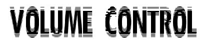
I like this font, as I believe that it represents the title in which shows that it’s controlling volume. The main advantage is the style of text as it looks like it’s moving/vibrating. (Above)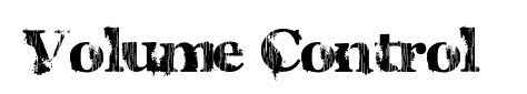

As soon as I saw this font I felt that it fitted both the magazine and band. This font’s main advantage is the creativity; I feel that this font is eye-catching because of the rotation used within each character. (Above)
I think that this font is suitable for a ‘indie’ band that targets a nice audience as it is quite simple and straight forward however I feel that this is a disadvantage as I was aiming for a font that was more creative. (Above)
Colour Scheme (Front Cover)
I have looked at several different colour schemes in which I want my magazine to follow, each colour scheme has been taken from different magazines and I am comparing them to see which schemes are best suited for my magazine and the audience I want to attract.
Black and Red:
I first analysed the colours black and red, I wanted to experiment with a variety of colours to see which worked well together. Black and red were well matched and suited my magazine. I have decided to have black, red, white and grey in my final magazine front cover, contents page and double spread. This is effective as it shows continuity within the magazine and reflects near professional standards. I feel that these colours are regularly used on existing magazines, this meaning that they are generally quite successful colours that work well with an audience. I like the idea of using these colours as I think that they stand out and are eye-catching for the audience.
Black and Yellow:
I feel that these colours would not help my magazine reach its potential; I strongly believe that these colours do not work well together as they don’t suit the title or the images that are placed on my front cover. A final disadvantage with this colour scheme is the fact that they are commonly not associated with each other, which is not beneficial for my magazine.
Black and Blue:
On my front cover I have tried the colour black and blue together however I didn’t feel they looked as good together as I had expected. I think that these colours are too dark for a magazine especially as they are often related as negative colours that would not help promote/advertise my magazine.
Black and Purple:
Immediately after trying these colours on my magazine front cover, I realised that these didn’t look professional and realistic. As they are both dark colours, I do not think that it would attract my target audience. A music magazine should be showing bold bright colours reflecting what is inside the magazine therefore I do not feel that these colours do this.
All of the contrasting colours above will also be used with white therefore the magazine cover will be of 3 main colours.
In conclusion, I have decided that black, red and white are going to be the three main colours on my front cover. I feel that these colours reflect what is inside the magazine and is similar to a stereotypical music magazine front cover.
Sketches
These are the sketches I have drawn. They have helped me throughout the production stages especially when designing the front cover. They have given me a rough idea of layout and the information I want on my final piece.


I have also taken images of the same models against a different background. I took these pictures against a brick wall as I looked at several existing magazines and a similar background was used.
I then decided that I wanted three models using musical equipment creating the look of a band (In this case Volume Control). I took lots of images in different positions and with different equipment. I then looked through these images, began manipulating them for an ideal look and finally picked the photo that was going to be on the front cover.
Editing the Image
Once I had chosen my final image, I then had to begin editing making it suitable for a high market magazine reflecting near professional standards. I used adobe Photoshop CS4 as I feel that this software is ideal for the task that lay ahead.


