
Ideas of the Magazine Title.
These are the ideas that I thought would be am ideal title for my magazine. When thinking about both advantages and disadvantages I feel that ‘Beat’ is most appropriate for my magazine as I feel this will attract the target audience I am aiming my magazine at.
The Beat
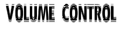
Volume Control
When I first started planning I thought this would be a good idea for the main title. However, after completing my research I felt that this would help later as a band name.
The Mix
Mega Mix
BEAT
I have chosen ‘BEAT’ because it is a one-syllable word, which will attract the audience. ‘BEAT’ is catchy and easy to remember, it also represents music, as it is part of music terminology that is relevant as it gives the audience a quick insight into the magazine.
The Hits
T
I used many different sources including the internet and existing magazines for inspiration when looking for different fonts. I was not sure what I wanted therefore this part of production was challenging. I looked at several fonts and narrowed them down to five. I analysed them and looked at both the advantages and disadvantages of the fonts which helped me make a difficult decision for the title of the magazine. When making my decision I took into consideration styles, textures and the overall feel of the font to see if it was suitable for a music magazine.

This font grabbed my attention immediately as it was perfect for what I wanted. In my opinion I believe that it has no disadvantages apart from colour which can only improve the font. Its main advantage is the fact it is stereotypical for a magazine font. I was also pleased with the look of my magazine front cover when this font was in use as it is similar to the style of the ‘NME’ font which can only be a good thing as ‘NME’ are highly successful within the creative media industries. (Above)
When I was picking my title, I thought this was a well-presented font. An advantage it has is the glow, to improve the glow I feel that colours could be experimented with to give a vibrant look, which would attract the audience’s eyes. A disadvantage is the style of the font; this font looks like it is more suited to be seen outside a theatre therefore not suitable for the genre of my magazine. (Above)

Ilike this font for my title; however I do not feel that it would suit the front cover of my magazine. Its advantages are the character spacing, as it looks distinctive and different to any other magazine. The main disadvantage is the fact that it is basic, this is shown with the lack off glows and drop shadows which are a fundamental part of the codes and conventions for magazines. (Above)
Fonts (Band Title)
Throughout the production stage I have also been looking for a distinctive font that would represent a modern ‘indie’ band. I have critically analysed all of the fonts below discussing the advantages and disadvantages of the fonts individually.
This font is bold and basic however I feel that is similar to the second font that I analysed. This font is weaker as it does not have the similar textured look, which I was aiming for. (Above)
I like this font, as I believe that it represents the title in which shows that it’s controlling volume. The main advantage is the style of text as it looks like it’s moving/vibrating. (Above)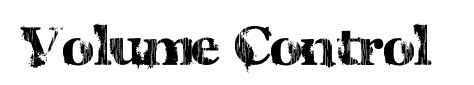

As soon as I saw this font I felt that it fitted both the magazine and band. This font’s main advantage is the creativity; I feel that this font is eye-catching because of the rotation used within each character. (Above)
I think that this font is suitable for a ‘indie’ band that targets a nice audience as it is quite simple and straight forward however I feel that this is a disadvantage as I was aiming for a font that was more creative. (Above)
Colour Scheme (Front Cover)
I have looked at several different colour schemes in which I want my magazine to follow, each colour scheme has been taken from different magazines and I am comparing them to see which schemes are best suited for my magazine and the audience I want to attract.
Black and Red:
I first analysed the colours black and red, I wanted to experiment with a variety of colours to see which worked well together. Black and red were well matched and suited my magazine. I have decided to have black, red, white and grey in my final magazine front cover, contents page and double spread. This is effective as it shows continuity within the magazine and reflects near professional standards. I feel that these colours are regularly used on existing magazines, this meaning that they are generally quite successful colours that work well with an audience. I like the idea of using these colours as I think that they stand out and are eye-catching for the audience.
Black and Yellow:
I feel that these colours would not help my magazine reach its potential; I strongly believe that these colours do not work well together as they don’t suit the title or the images that are placed on my front cover. A final disadvantage with this colour scheme is the fact that they are commonly not associated with each other, which is not beneficial for my magazine.
Black and Blue:
On my front cover I have tried the colour black and blue together however I didn’t feel they looked as good together as I had expected. I think that these colours are too dark for a magazine especially as they are often related as negative colours that would not help promote/advertise my magazine.
Black and Purple:
Immediately after trying these colours on my magazine front cover, I realised that these didn’t look professional and realistic. As they are both dark colours, I do not think that it would attract my target audience. A music magazine should be showing bold bright colours reflecting what is inside the magazine therefore I do not feel that these colours do this.
All of the contrasting colours above will also be used with white therefore the magazine cover will be of 3 main colours.
In conclusion, I have decided that black, red and white are going to be the three main colours on my front cover. I feel that these colours reflect what is inside the magazine and is similar to a stereotypical music magazine front cover.
Sketches
These are the sketches I have drawn. They have helped me throughout the production stages especially when designing the front cover. They have given me a rough idea of layout and the information I want on my final piece.


In this section of planning, I am going to decide on the location of where I’m going to take pictures, costumes, make up, hair and the lighting. I have decided that my genre is Indie so therefore all of the above need to fit into the ‘indie’ category.
The costumes are an essential part of the photographs I have taken. I dressed my models in casual, dull clothes that I felt fitted the ‘Indie’ look, making it more realistic.
I then experimented with different hairstyles for my models. I decided that wanted two of my models to have natural hair and one of my models to have a modern stylish haircut. I decided to research via the Internet on ‘indie’ looks and different hairstyles, this was a positive experience as it helped me create the look that I was going for.
I also used natural make up on the characters. Firstly I tried dark black eye make up, however I did not like this and felt this was more the genre of Rock rather than Indie. This was beneficial experience as it helped me realise the importance of natural make up especially in photo shoot circumstances.
After the models were in costume I began to decide the location. I took pictures in several places and decided on the best three. For my first photo shoot I created a band using a guitar microphone and speakers, which helped, give the musical vibe and atmosphere. I set this up in a dark room with no background. I feel this worked well as it was ideal for my front cover. I also took other images behind a collage of magazine with my model in front playing a guitar. I used the same model but experimented with different backdrops to get a desired look. I liked these photographs however I did not feel they looked good on the front cover, I found use for them in the contents page.
All of the above helped create a perfect photograph for my front cover. I needed to make my image look realistic, as it should be what attracts my target audience. The image takes up a lot of space on my front cover therefore it will be the first thing the buyers see which could affect whether they purchase the magazine or not
Images
These are some of the photographs I took, I then decided which one’s were best suited for my final piece.

I have taken these images of a model in a suit to represent a look/style commonly seen at a music event.
These are pictures of models in costume against the collage background. I liked these images as they were original; however felt that they did not work well with the rest of my front cover.

I have also taken images of the same models against a different background. I took these pictures against a brick wall as I looked at several existing magazines and a similar background was used.
I then decided that I wanted three models using musical equipment creating the look of a band (In this case Volume Control). I took lots of images in different positions and with different equipment. I then looked through these images, began manipulating them for an ideal look and finally picked the photo that was going to be on the front cover.
Editing the Image
Once I had chosen my final image, I then had to begin editing making it suitable for a high market magazine reflecting near professional standards. I used adobe Photoshop CS4 as I feel that this software is ideal for the task that lay ahead.

I have print screened this showing how I first started to cut out the image getting rid of most of the background. (Above)

After most of the image had been cut out I zoomed into several different parts making sure it was neat. In this case I had to cut out more around the ear, as the background was still visible. (Above)


I then zoomed out checking that the task was completed neatly, I also experimented with the blending options available with the software package. I adjusted the drop shadow amount to get the desired look. (Above)
Final Touches
After I cut out the pictures I began making final touches, getting rid of blemishes and also taking out red eye which I am going to show below.


My next task was to remove the red eye; I was able to complete this task by using the red eye removal tool that comes with the Photoshop package. I then re-created the eye by using the brush tool, selecting the colour white from the palette and painted the pupil in the eye.

The first disadvantage was that it didn’t fit the genre I was aiming my magazine at. I feel it looked more like I was aiming to attract an audience who were interested in classic music rather than indie music.
Another disadvantage is the image of a piano at the bottom. On the other hand this can also been seen as a disadvantage ad it does not associate with the genre of music.
I also felt the price was very low. Originally I thought the price would attract a wider audience. For example, if another magazine was £4.50 people were more likely to go for the cheaper magazine. However, once researching and thinking about this I decided this was not the case.
Once evaluating this template in detail, I found several disadvantages and not so many advantages. In my research I found out that red and black were stereotypical colours for a music magazine. However, once I had designed this magazine I felt blue and black looked better.
Overall I feel this magazine was not as successful as wished therefore I were then going to re complete a magazine following the structure of my planning.

No comments:
Post a Comment